The Great 2026 Redesign
For a couple years now, maxwelljoslyn.com has been sorely in need of a facelift and some new functionality for user-friendliness. Over the last few weeks I've finally gotten around to that, and if you're reading this, you're on the new version of the site.
The rest of this post is a showcase comparing what the site looked like before and after mid-September 2026, for the sake of future visitors (including me).
A Better Homepage
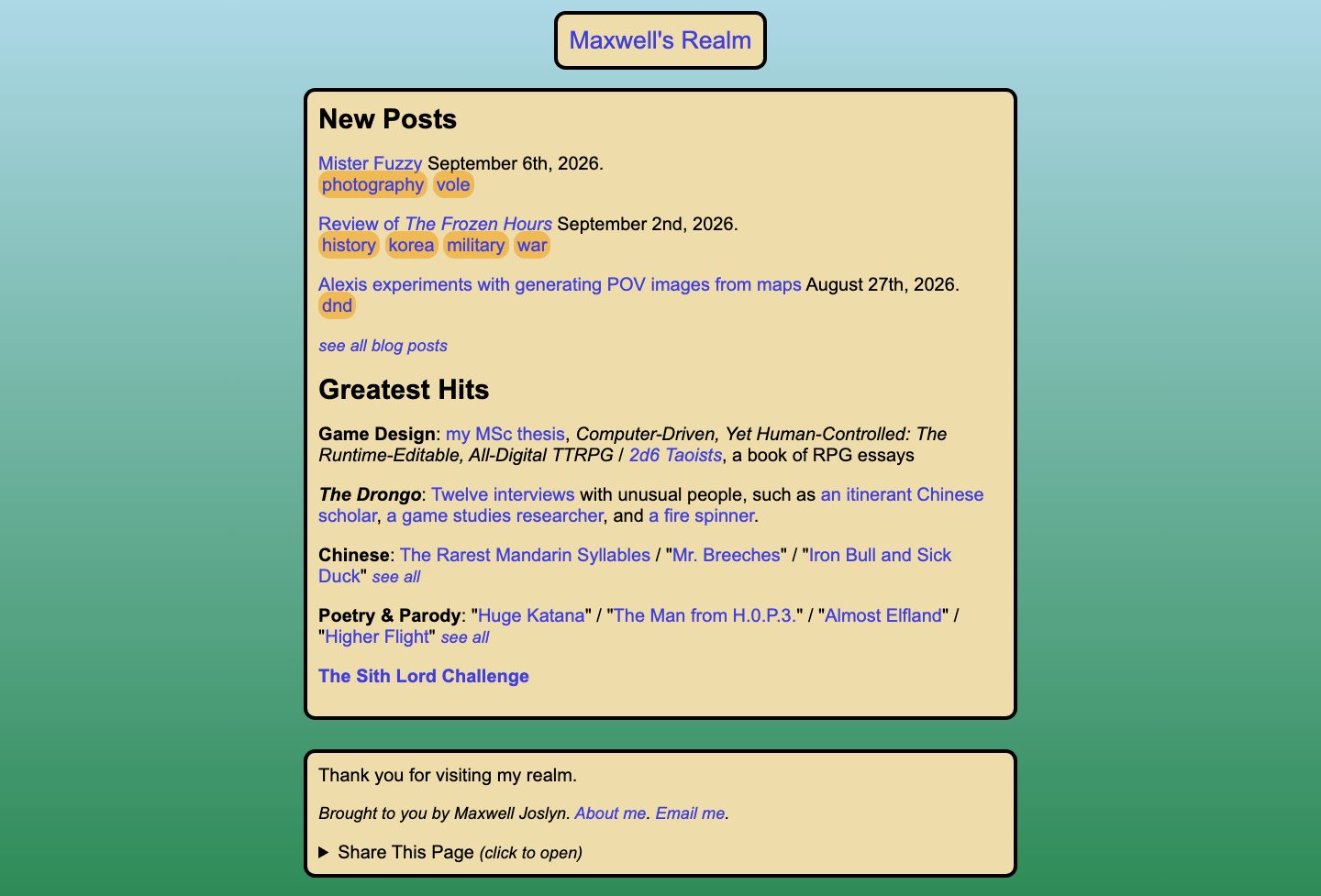
The homepage is a better experience for new and returning readers alike. "Greatest Hits" comes first, is updated for 2026, and is slimmed down to make room for a photo gallery! After that, we segue cleanly into new posts.
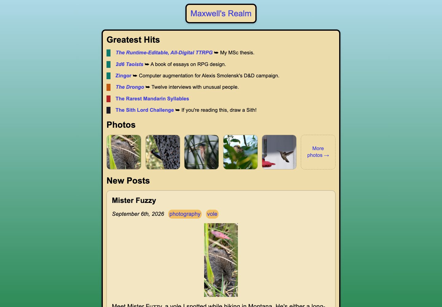
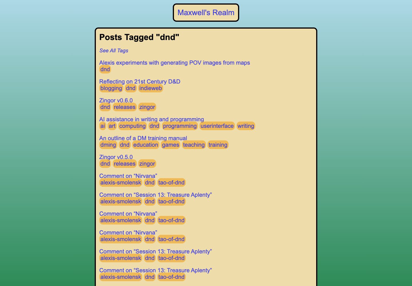
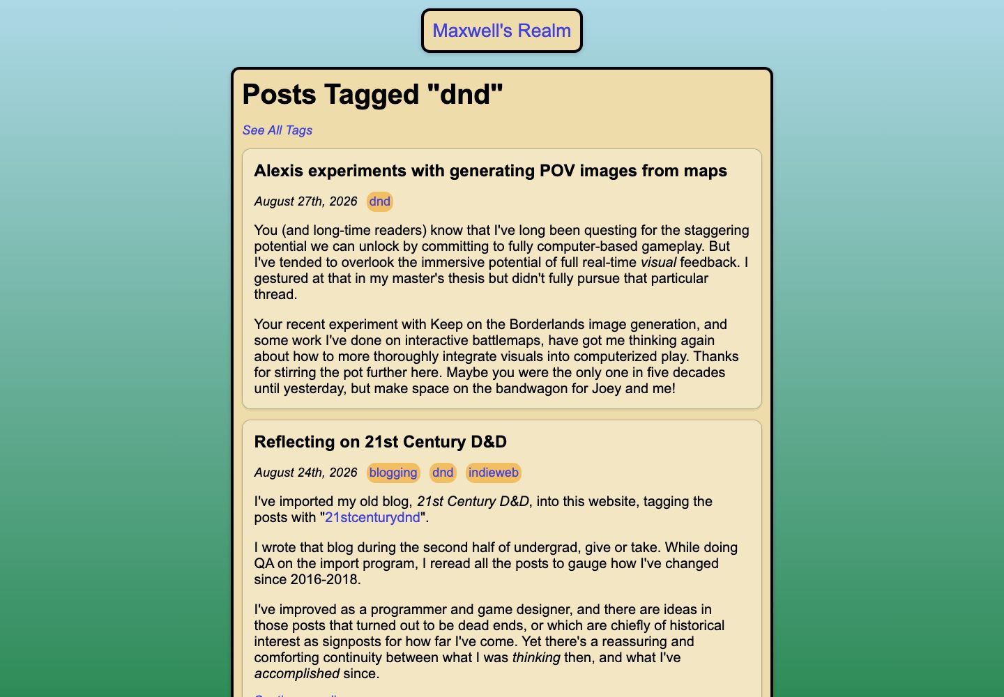
Another big, immediately obvious change is that post content is now embedded wherever posts are referenced, such as the homepage, the /blog page (below), tag pages (e.g. /tags/bird), and my collections of book reviews and movie reviews.
Previously, it was hard to quickly get a sense of my writing style or what my blog was even about. Now you can casually scroll through posts and decide what to read based on more than just a title plus tags.
More Ways to Navigate
Every post's permalink page now links to the next-oldest and next-newest post: a standard navigational convenience which was sorely lacking. Individual post pages were also tweaked to show more post content above the fold, especially on mobile.
I also added a feature which shipped ahead of the rest of the redesign: "On This Day", which lets you jump to other posts made on that same day in different years. It's a fun way to see how my interests have evolved over time, while being less chaotic than a "Random Post" button.
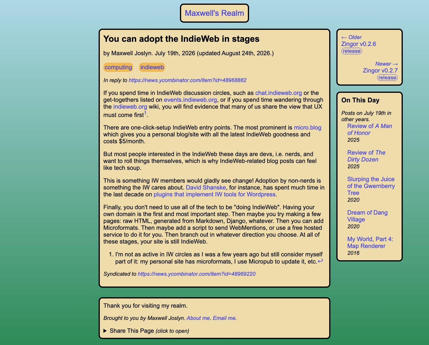
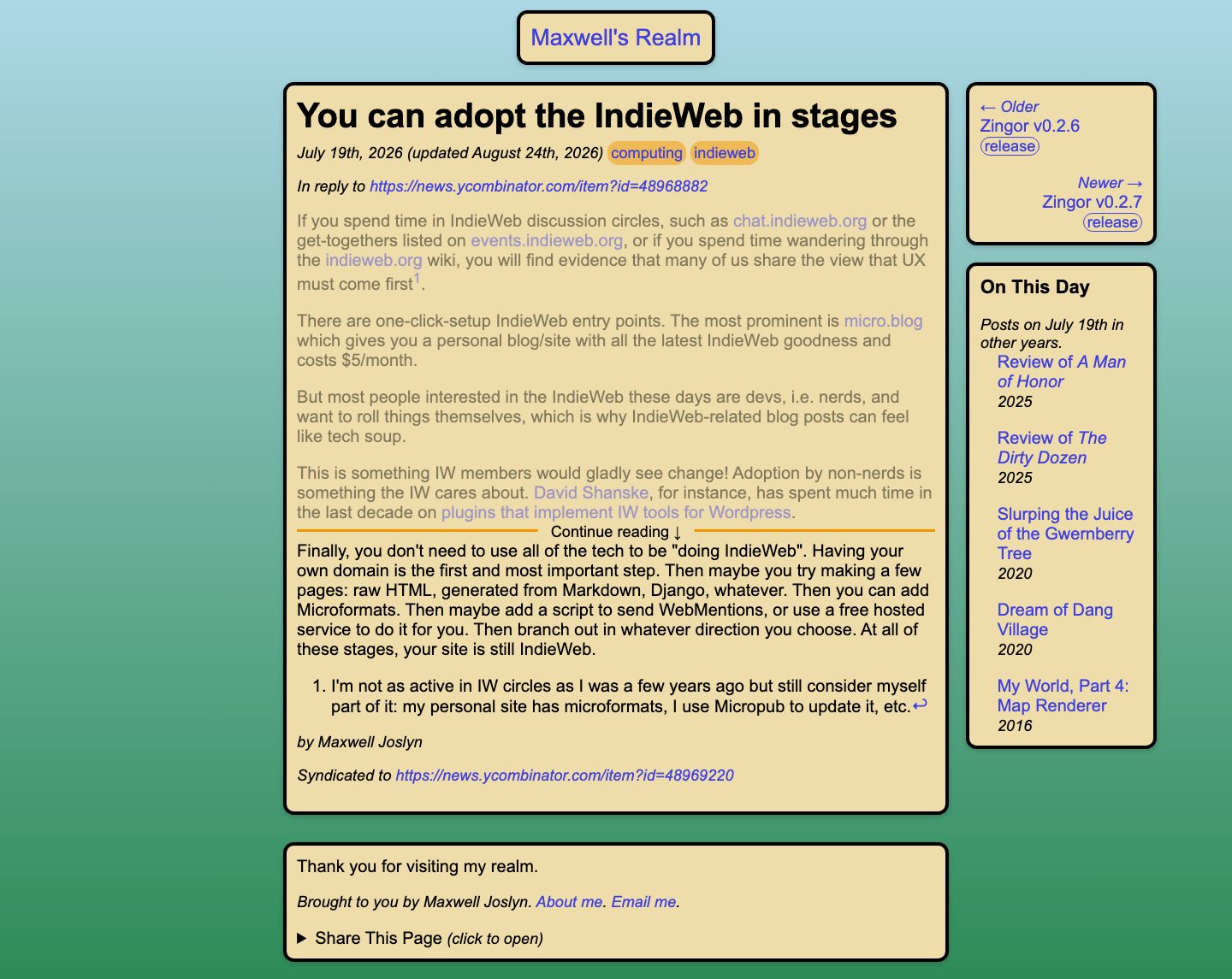
If you clicked through a "Continue Reading" link in an excerpt, you'll get a modified view that shows you where to ... continue reading. Compare this screenshot to the one above:
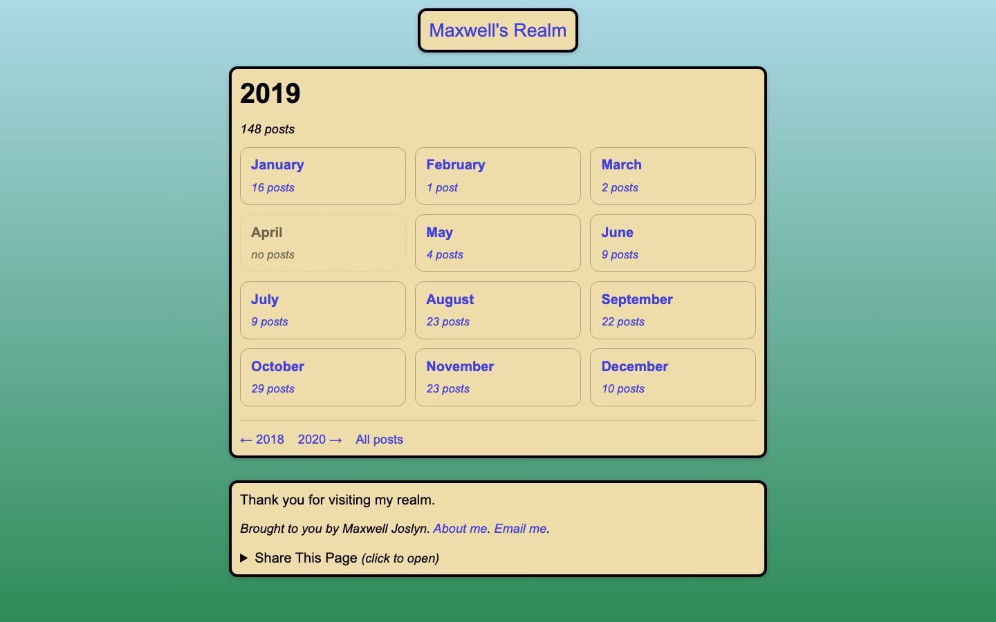
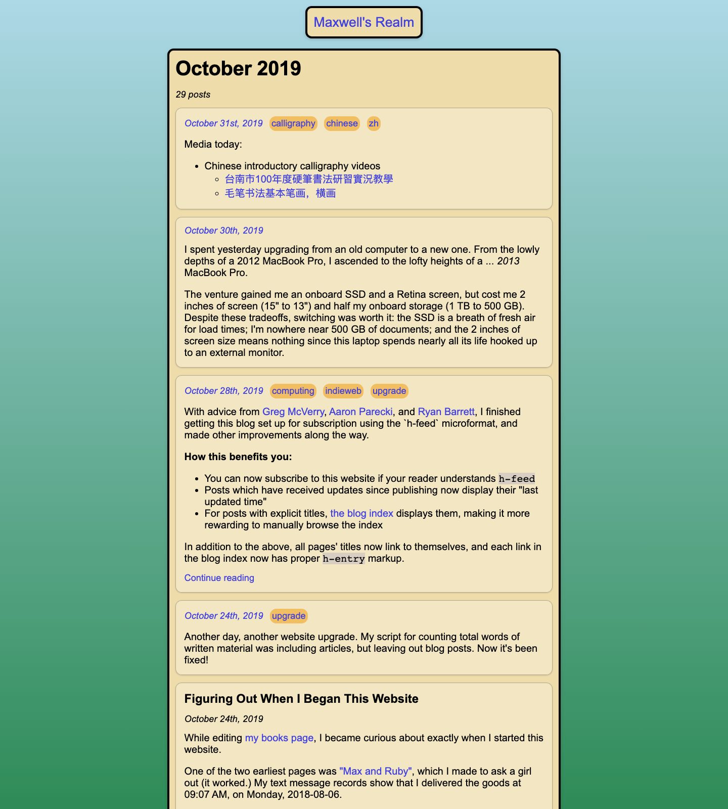
Chronological browsing now has much better support, with a new /archive page that links to pages for each year and month, shown here: